Team: Yang(Cindy) Jin, Daniel Xie, Zhaorui Zhang
Timeline: 4 weeks | Nov 2024 - Dec 2024
Tools: Figma, Google Slides, Google Docs


Technical Downtime and Malfunctions
↓
Kiosk black screen
User Interface and Usability Issues
↓
Unintuitive Design
Limited Accessibility
↓
No adjustable Height Option
Encountered Problems:

Encountered Problems:


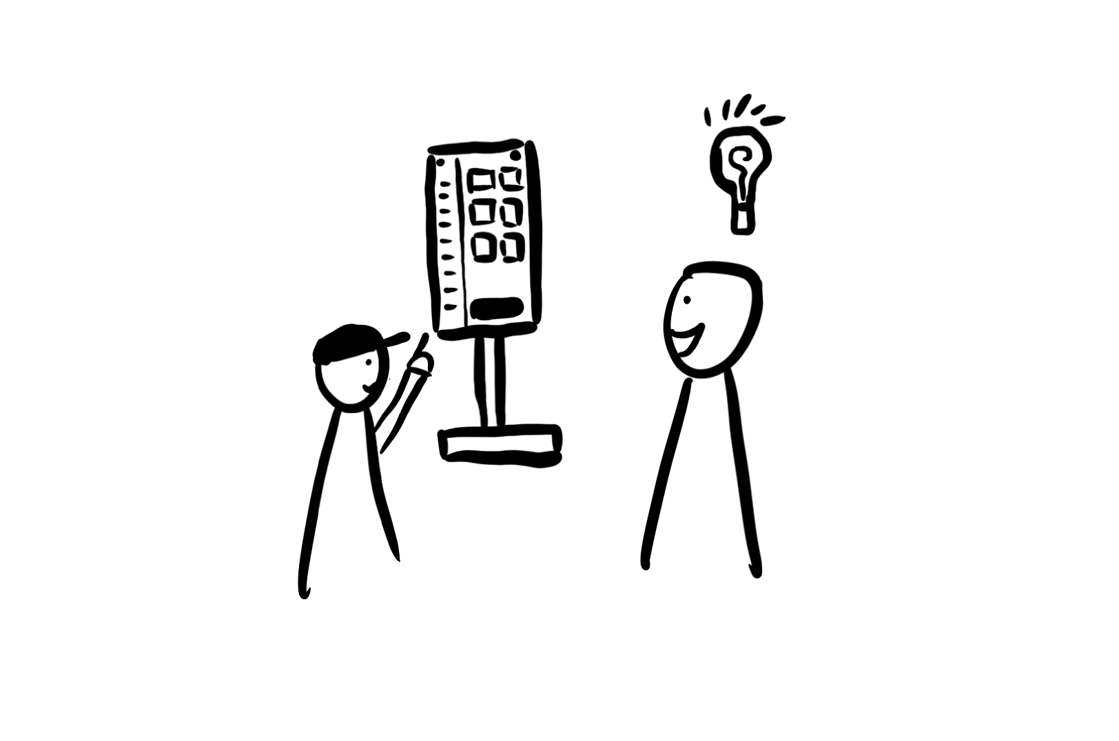
A first-time customer enters the shop and is unfamiliar with using the kiosk.
The customer feels hesitant and unsure how to operate the kiosk, slowing down the ordering process.
An employee is available to introduce the kiosk to first-time users, answering any questions and guiding them through the steps.
The customer gains confidence in using the kiosk and completes their order smoothly. They feel comfortable using the kiosk independently on future visits.


A regular customer who frequently orders the same drink wants a fast way to reorder without going through the entire customization process.
The customer has to reselect options for their preferred drink each time, which feels repetitive and time-consuming.
The kiosk offers a “favorites” feature where customers can save their usual order for quick access.
The customer selects their saved order in one click, completing the process quickly. This feature adds convenience and builds loyalty.


During off-peak hours, a customer with a simple order wants to grab a quick drink without waiting.
The current ordering process doesn’t allow quick, express options, even for straightforward orders, leading to unnecessary wait times.
An express ordering option is available on the kiosk for commonly ordered items.
The customer selects the express option, places their order swiftly, and receives their drink without delay, enhancing their experience.


A young adult enters a boba tea shop during peak hours, looking to place an order quickly.
They struggle to find the kiosk due to unclear placement and end up waiting in line at the counter, increasing their frustration.
The kiosk is positioned near the entrance, making it immediately visible to customers as they enter.
The customer sees the kiosk right away, uses it to place an order quickly, and avoids waiting in the long counter line. Their experience is faster and more convenient.
1.1. Slow and Unresponsive Interfaces
1.2. Outdated Hardware Impacting User Experience
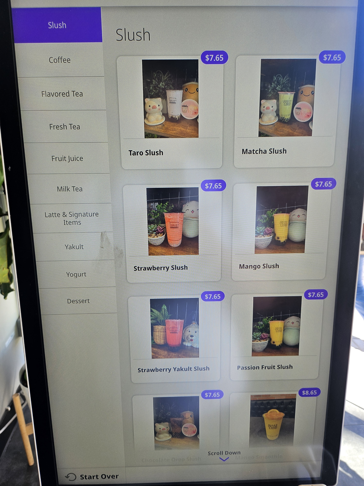
2.1. Difficulties Navigating Menu Categories
2.2. Poor Layout of Options Causing Mistakes
3.1. Small and Hard-to-Read Text
3.2. Unclear Icons and Button Functions
4.1. Misleading Membership Sign-In Prompt
4.2. Phone Number Requirement
5.1. Issues with Drink Customization Options
5.2. Inconvenient Placement of Tipping Option
6.1. Frequent System Freezes and Restarts
6.2. Lack of a Reliable Backup Option
7.1. Limited Personalization and Recommendations
7.2. Reduced Comfort and Flexibility Compared to In-Person Ordering


An innovative boba shop kiosk designed to address key pain points in the boba checkout experience.

Our kiosk is designed to be placed at any boba shops that are striving to provide a smooth and welcoming checkout experience for their customers while improving their brand images and shopping reputations.

Our kiosk screen is thoughtfully designed with height accessibility in mind, addressing a key issue identified during our user research. Users can effortlessly adjust the screen to their preferred height by simply dragging it up or down, ensuring a comfortable experience for teenagers, taller individuals, and people with disabilities alike.
The Corridor kiosk embodies our brand identity not only through its digital interface but also in its physical design and aesthetics. The warm, milk tea-inspired tones on the kiosk's body, paired with boba-themed decorations and our signature logo, create a cohesive visual experience that reflects brand authenticity and fosters customer loyalty.


The checkout symbol and credit card slot are strategically positioned next to the screen for easy accessibility. Additionally, the physical order ticket is printed from the side of the kiosk, allowing users to conveniently retrieve it.


We went to Home Depot to carefully select medium-density fiberboard (1/4 in. × 2 ft. × 4 ft.) with the appropriate size and hardness for our kiosk structure.


Using Inkscape, we calculated the dimensions for cutting the wood boards and designed the engraved patterns.


At the UCSD Makerspace, we used a laser cutter to precisely cut the wood boards according to our design specifications.


We glued all the wood boards together and attached magnets in the appropriate positions to ensure stability and functionality.


We painted the exterior and added artistic patterns to give the kiosk an appealing and polished final look.


Cindy Jin: Led the creation of Figma low-fidelity and high-fidelity prototypes, developed early sketches, conducted fieldwork and user research, created user personas, established branding guidelines, contributed to building the physical kiosk, and actively participated in the final showcase.
Daniel Xie: Contributed to Figma low-fidelity and high-fidelity prototypes, conducted online research, participated in fieldwork and user research, analyzed user research results, assisted in building the physical kiosk, and actively participated in the final showcase.
Zhaorui Zhang: Contributed to Figma high-fidelity prototypes, engaged in fieldwork and user research, developed storyboards, contributed to building the physical kiosk, and participated in the final showcase.
jinyang030716@gmail.com