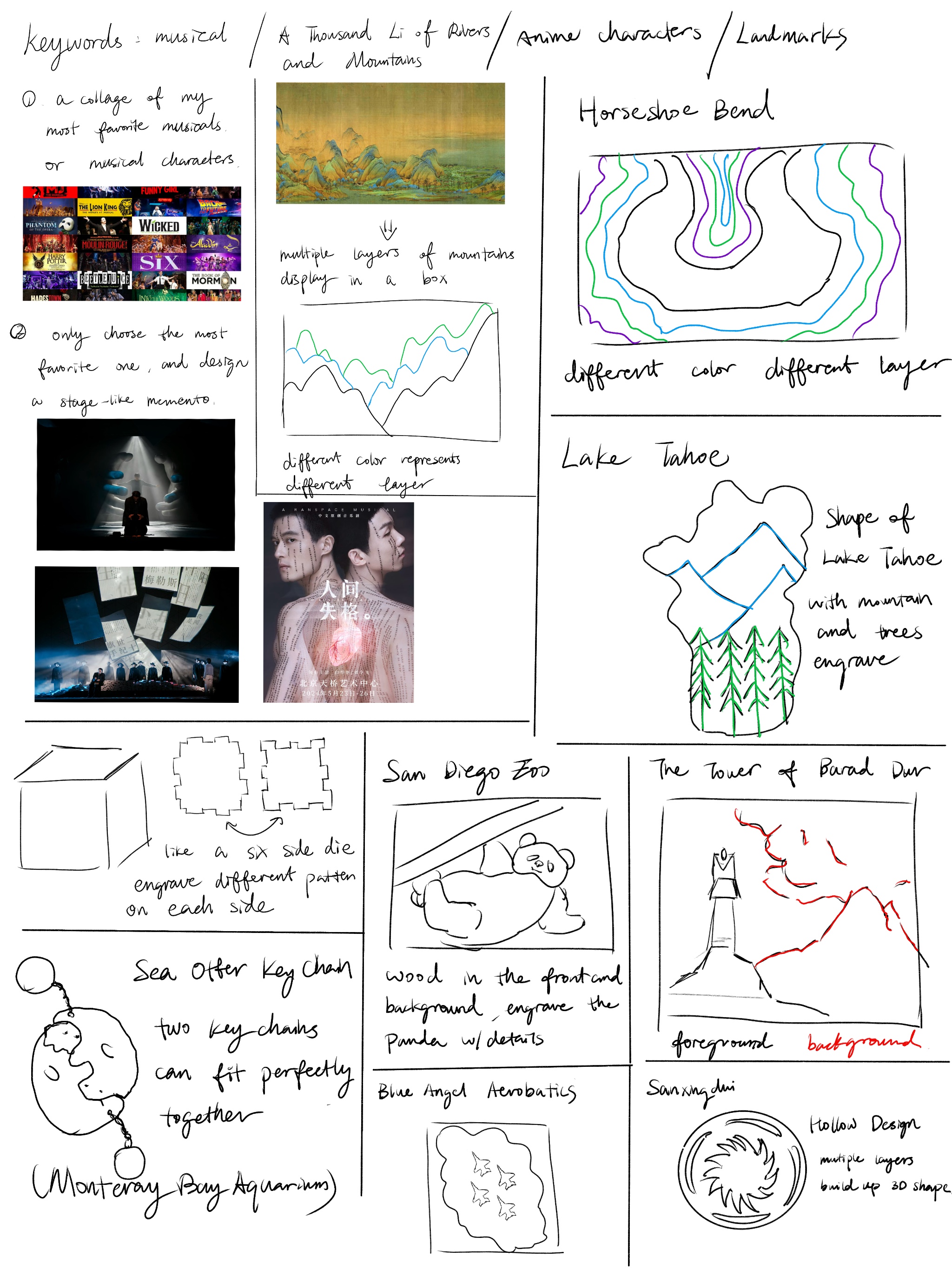
By: Yang(Cindy) Jin
Timeline: 10 weeks | Oct 2024 - Dec 2024
Tools: Adobe Photoshop & Illustrator (Poster), Inkscape (Laser Cutting)

My memento design is a physical representation of the emotional intensity in No Longer Human. I was captivated by the musical’s lighting, set design, and storytelling, which inspired me to create a layered, stage-like structure using laser-cut wood. The design features two suspended hands and a mask-like face, symbolizing the internal struggle of the protagonist, Ōba Yōzō, and his conflict with authority. The backdrop includes covers of Dazai’s famous works, reinforcing his literary legacy. Throughout the process, I faced challenges in ensuring precise interlocking of the wooden pieces, troubleshooting laser-cutting errors, and refining composition for maximum impact. Despite the technical difficulties, I successfully translated my vision into a tangible piece that embodies the tension and artistry of the musical.
I began by sketching out different concepts inspired by the musical’s stage design. My goal was to create a structure that felt dynamic and theatrical while maintaining clarity in form. I experimented with various ways to represent the protagonist’s struggle and tested different compositions before selecting a final direction. Additionally, I explored how the wooden pieces could interlock seamlessly, ensuring stability without compromising the aesthetics.


After finalizing the initial sketches, I moved to digital prototyping in Inkscape. This stage required precise calculations to accommodate the fixed 1/8-inch wood thickness while maintaining the layered effect. I refined the character placements, adjusted the proportions of the supporting structure, and tested different layouts to enhance depth and visual impact.

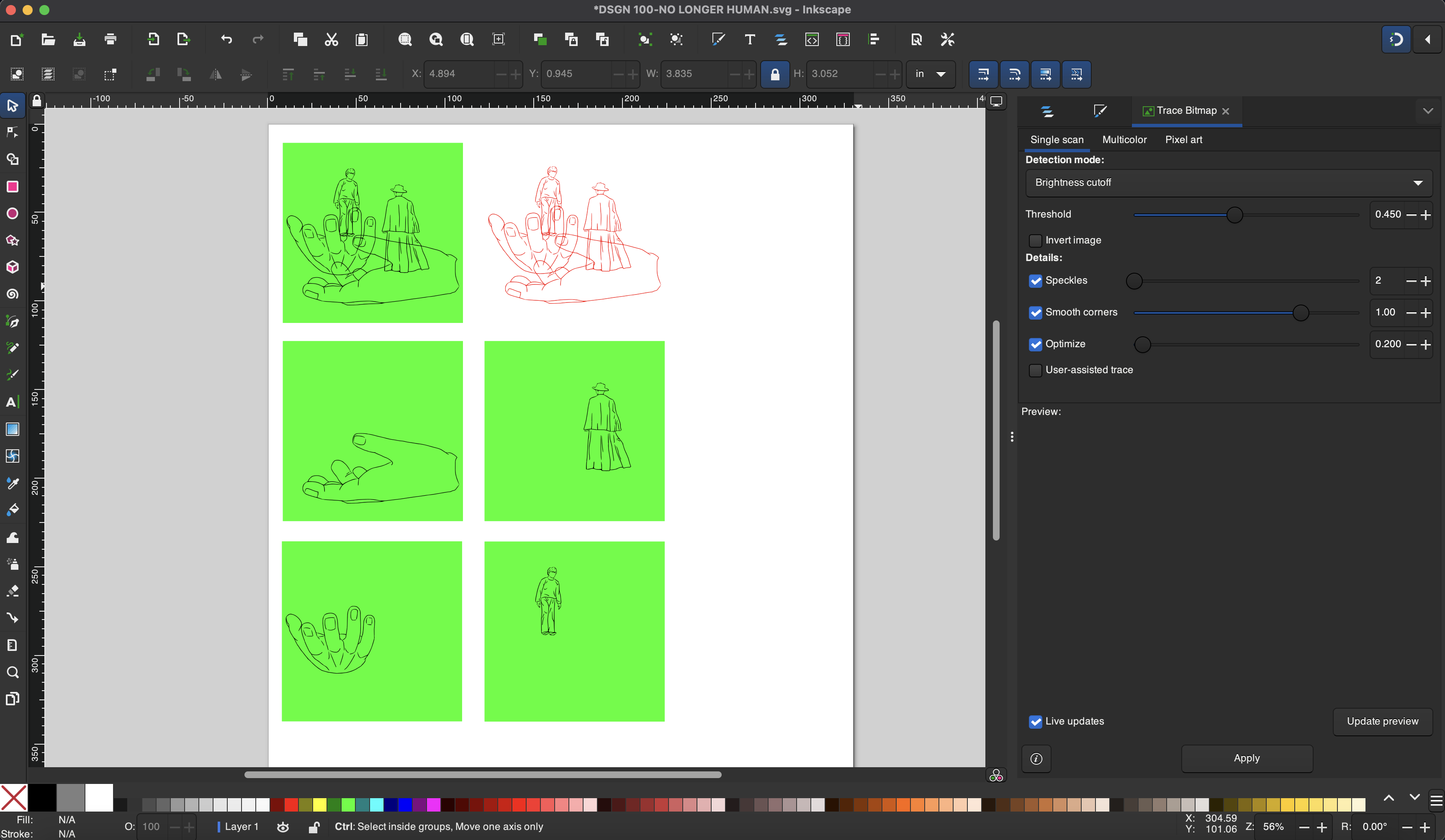


The transition from digital design to physical execution came with challenges. The software initially misrecognized my character outlines, treating them as shapes instead of cuttable lines. Additionally, improper laser power settings resulted in burn marks or incomplete cuts. Through multiple iterations, I resolved these issues by fine-tuning the settings and modifying the vector files to ensure clean, precise cuts.

The final piece successfully captures the theatrical quality I envisioned. The suspended hands and mask-like face create a sense of movement and tension, while the backdrop of Dazai’s works adds context to the story. After assembling the layers and making final adjustments, I was satisfied with how the memento conveyed both the emotional depth and artistic style of No Longer Human.


The poster design project allowed me to further explore how visual composition and typography can communicate the themes of No Longer Human. My goal was to create a design that not only captured the essence of the musical but also presented key information in a clear and engaging way. I went through multiple iterations, refining the layout, type choices, and image placement to strike the right balance between aesthetics and readability. Through this process, I developed a deeper understanding of how hierarchy, contrast, and alignment can influence the viewer’s perception.
I started with ten hand-drawn sketches, exploring different compositions and typographic arrangements. This stage was crucial in brainstorming creative layouts while ensuring that the poster remained functional in conveying information.


Using a grid system, I developed two digital versions in black and white to establish a strong structural foundation. One design placed the text around the edges, framing the image in the center, while the other mimicked a book cover layout, with the title centrally positioned and other text symmetrically aligned.


I refined the designs by incorporating typography and imagery. I selected a serif font for the title to evoke the somber tone of the story, contrasted by a formal typeface for the event details and an expressive one for the quotes. For the visuals, I experimented with dense typography behind the characters to highlight their inner conflict, using Photoshop to enhance depth and drama.


Based on critique feedback, I made key adjustments to improve readability and information hierarchy. I repositioned the English title to follow a natural reading flow, reduced the image size to emphasize text, and added more detailed descriptions. To enhance contrast, I adjusted the color of key elements and used quotes as decorative fillers, ensuring that the final poster was both visually compelling and informative.

jinyang030716@gmail.com