By: Yang(Cindy) Jin
Timeline: 4 weeks | Feb 2024
Tools: Figma, Webflow
Link (This portfolio website is showcased with permission from Jiaming Ma): https://jiamingma.webflow.io/

Before designing and developing Jiaming Ma’s portfolio website, I conducted requirement gathering to ensure the final product aligns with his vision as a filmmaker. Through discussions, he highlighted the following key expectations for his portfolio:
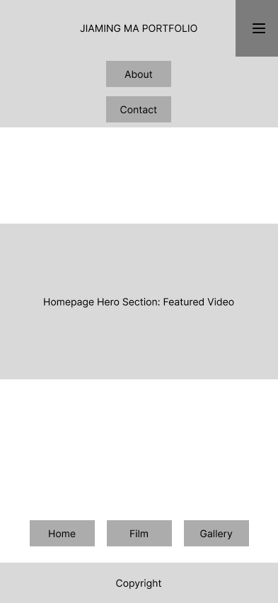
Opening Splash Screen – Upon entering the website, a full-screen introduction should display "Jiaming Ma Portfolio Website" before transitioning into the main site.
Unique Navigation Placement – The navigation bar should not follow the conventional top placement; instead, it should be positioned on the side or bottom for a distinctive layout.
Fullscreen Hero Video on Homepage – The homepage should feature a full-screen video montage showcasing clips from his films.
Interactive Film Preview – Users should be able to hover over film previews to play them, and playback should pause when the mouse moves away.
Two-Column Film Display – The film page should be structured into two columns for a clean and organized layout.
Optimized Gallery Layout – Images should not be too large so that users can view multiple photos at once without excessive scrolling.
Centered About Section – Jiaming’s biography should be centered for better readability and balance.
Centered Contact Information – Contact details should also be centered on the page to maintain visual harmony.
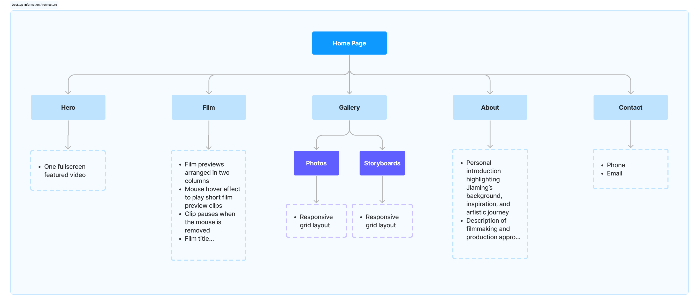


The final design of Jiaming Ma’s portfolio website delivers a cinematic and professional experience tailored to his work in film and media production. The desktop version features a fullscreen hero video on the homepage, immediately immersing visitors in his creative world. The Film section presents projects in a structured two-column layout with hover-based previews, allowing users to interact seamlessly with the content. The Gallery adapts a responsive grid to display photography, storyboards, and production notes, ensuring a visually dynamic experience. The About and Contact pages center their content to maintain balance and readability within a minimalist, dark-themed aesthetic.
For the mobile version, the navigation is streamlined into a compact menu for accessibility. The hero video remains a central feature, while the film previews retain hover-based interactions that activate on tap. The gallery grid dynamically adjusts to screen size, ensuring an optimized browsing experience without excessive scrolling. The About and Contact sections maintain their centered layout for clarity, making essential information easy to access.
By prioritizing clarity, accessibility, and immersive storytelling, the website establishes a compelling and seamless online presence across both desktop and mobile platforms, effectively showcasing Jiaming’s work to industry professionals and collaborators.


jinyang030716@gmail.com