Canvas Discussion Board Redesign

A Case Study

Team: Yang(Cindy) Jin, Daniel Xie, Kexin Zhou, Zhaorui Zhang
Timeline: 2 weeks | Dec 2024
Tools: Figma, Google Slides, Google Docs

Figma Prototype
Project Overview
Our project focused on redesigning the Canvas discussion board to address key usability challenges faced by students. The existing interface struggled with inefficient navigation, limited search functionality, and poor engagement features. Through competitive analysis, user interviews, and iterative prototyping, we developed two redesigns that introduced advanced search filters, threaded replies, quick reaction options, and improved visual clarity. The final design enables students to efficiently navigate discussions, interact with peers, and engage in meaningful conversations, enhancing the overall usability and user experience of the platform.
My Contributions
I was responsible for creating user testing plans for both the first and second rounds, outlining key tasks and evaluation criteria. After the initial testing phase, I conducted a detailed analysis of the results, identifying usability issues and opportunities for improvement. I also led the component selection for redesign, prioritizing features like search functionality, reply mechanisms, and user engagement tools. In the design phase, I contributed to sketch solutions for redesign and played a key role in developing the second redesign prototype. Additionally, I executed user testing sessions across both rounds, collecting valuable feedback and refining the design to address user needs effectively.

Introduction

Rationale for Choosing Canvas

We selected Canvas as our redesign target because it’s an app we all interact with daily as college students. Through our regular use, each team member has encountered various challenges and frustrations with the mobile app, making it a natural choice for improvement. Our personal experiences provided us with valuable insights and a strong motivation to address these issues.

Why UCSD Students Are Our Target Users

UCSD undergraduate students were chosen as our primary user group because they are frequent users of Canvas and, as such, have accumulated meaningful experiences and opinions about the app's functionality. Additionally, their proximity and accessibility make them ideal participants for interviews and user testing within our school environment.

Biases and Limitations in User Selection

Our user group is limited to UCSD students using the university’s customized version of Canvas, which may include unique features not present in versions used by other institutions. By focusing exclusively on students, we risk overlooking the perspectives and needs of other key user groups, such as instructors and graders. Furthermore, our selected student participants might not fully represent the diversity of the broader Canvas student user base, potentially limiting the scope of our findings.

User Testing Plan

Scenario 1: Discussion Section

Background for the User

“You want to engage in a course discussion by viewing and tracking replies to a specific discussion topic while managing notifications effectively.”

Interview Questions

  • When do you usually go to the discussion page? Is it to read replies, post something, or for another reason?
  • Can you walk me through how you normally post a reply? Are there any parts of the process that feel annoying or hard to do?
  • Have you ever had trouble using the discussion page? For example, finding a reply, starting a new thread, or understanding how it works?
  • If you could make the discussion page better, what would you change? Maybe make it easier to reply, more interactive, or anything else?

Task for Testing:

  1. Navigate to the discussion section of a specific course.
  2. Locate a specific topic within the discussion page and browse  through the existing replies.
  3. Post a reply to the topic, using formatting options (e.g., bold, bullet points, or links) to make your response engaging.
  4. Interact with an existing reply by liking or reacting to it (if supported) or adding a comment to start a sub-thread.
  5. Create a new discussion topic and add an initial post with a clear question or statement to encourage peer engagement.

Scenario 2: Grading

Background for the User

“You want to review detailed grading information, such as the mean, median, and highest grade received in your class, as well as the grade distribution of each assignment category (e.g., discussion, reflection, midterm, final) for your course.”

Interview Questions

  • How often do you check your grades using the Canvas mobile app, and what usually makes you want to check them?
  • Can you show me how you typically use the Canvas mobile app to check your grades?
  • Do you think there’s any important information missing from the grades page?
  • What additional details or features would you like to see on the grades page?

Task for Testing:

  1. Open the Canvas app and navigate to the grades section for a specific course.
  2. Find the grade for a specific assignment or quiz and check if there are any details like feedback or grading criteria.
  3. Look at your overall course grade and try to find how much each assignment or exam contributes to it.

Scenario 3: To-Do List

Background for the User

“You want to review and prioritize your assignments based on due dates.”

Interview Questions

  • How often do you check the Canvas to-do list, and what usually makes you want to use it?
  • Can you show me how you normally look at your to-do list and find what’s due?
  • Do you think it’s easy to tell the deadlines for different courses on the to-do list?
  • What changes do you think would make the to-do list more helpful for you?

Task for Testing:

  1. Open the Canvas to-do list and look at the assignments for today and the rest of the week.
  2. Identify which assignments are due today and from which courses.
  3. Try to find details for a specific assignment (e.g., submission instructions or additional resources) directly from the to-do list.

User Testing Analysis

Participant #1

  1. Finding specific posts or replies in the discussion board is cumbersome. The app lacks advanced sorting and filtering options, forcing users to scroll through numerous posts, especially when replying to someone specific.
  2. The grading page lacks important contextual information, such as grade distribution and assignment weight, which are sometimes available on the desktop version but not on the mobile app.
  3. The to-do list is cramped and does not present deadlines or due dates clearly. Users must read through fine print to identify the relevant details.

Participant #2

  1. The user quickly navigated to the discussion page but took a moment to locate the specific topic.
  2. They used formatting options with ease, but they paused to figure out where the "like" or "react" button was.
  3. Creating a new discussion topic was straightforward, but the user commented on the lack of templates or guidance for encouraging engagement.

Participant #3

  1. The lack of interactivity discourages both students and instructors from actively participating in discussions.
  2. The participant used the discussion page only to find announcements, suggesting that the feature’s primary purpose is misunderstood or underutilized. 
  3. The discussion page lacks features that make interactions dynamic and engaging, such as quick replies, reactions, or multimedia embedding.

Participant #4

  1. The participant struggled to locate posts, replies, and assignments due to a lack of sorting and filtering options. The discussion section required excessive scrolling, and the to-do list felt cluttered, with overdue and upcoming tasks mixed together.
  2. The grading page lacked essential details like grade distribution (mean, median, highest grades) and assignment weight, making it hard for the participant to assess performance and understand grade calculations.
  3. Managing replies in discussions was difficult due to unclear hierarchies and a lack of collapsible threads. Accessing detailed feedback or rubrics for assignments involved too many steps, causing frustration.

Summary (Common Challenges)

Navigation and Searchability

  • Participants consistently struggled with finding specific posts or replies in the discussion board.
  • The lack of advanced sorting, filtering options, and clear thread hierarchies required excessive scrolling, leading to frustration.

Feature Gaps in Discussion Interactivity

  • The discussion board was perceived as static and not conducive to engagement.
  • Features like quick replies, reactions, and multimedia embedding were noticeably absent, reducing the board’s utility as a dynamic communication tool.

User Engagement and Guidance

  • The lack of guidance for creating engaging discussions and the misunderstood purpose of the discussion page led to underutilization of features.

Component Selection for Redesign

Based on our user testing analysis, the most common and recurring issues were identified on the Canvas discussion board page. These challenges, including difficulties in navigation, limited interactivity, and lack of user engagement guidance, led us to select this component for redesign.

Competitve Analysis

Competitor Solutions

Reddit

Navigation and Searchability

Reddit allows users to search for key words first to find a specific community. Once inside the specific community, users can further search for a specific posts or tags that they are looking for. This way, there is a lot less difficulty on the user’s part to navigate to their desired posts.

Slack

Engagement and Interactivity

Slack allows users to react to posts and replies with emojis of user’s choices. Messages can be multimedia, with a preview to the linked website, allowing for more interactions.

Navigation and Searchability

Slack allow users to search for key words in a specific channel to help users find information.

X

Engagement and Interactivity

X allows users to react to posts by liking, quoting, and retweet posts. There is also a home page “For you” section with curated posts for users to increase engagement. Posts can be multimedia, with a preview to the linked website, pictures, and articles, allowing for more interactions.

Navigation and Searchability

X allows users to search for key words, which shows any accounts, posts related to it to help users find information.

Solution Sketches

Sort Function Redesign Sketch

The sort functionality only had one category, time. It is fairly limited how much students can interact with the search bar and type of content they can search and filter. Therefore, we create a sketch that added more categories and types of discussions that increase the navigation and interaction of the discussion component.

Reply Function Redesign Sketch

Currently students can only reply to the main post by clicking the “reply” button, which creates a new text block. In this sketch, we added a reply button to each text block, so that students can also reply to each other. In this case, the replying block will automatically quote the message being replied. In addition, students can now make quick reactions to the main post and its replies by clicking the “like” icon.

Discussion Section Redesign Sketch

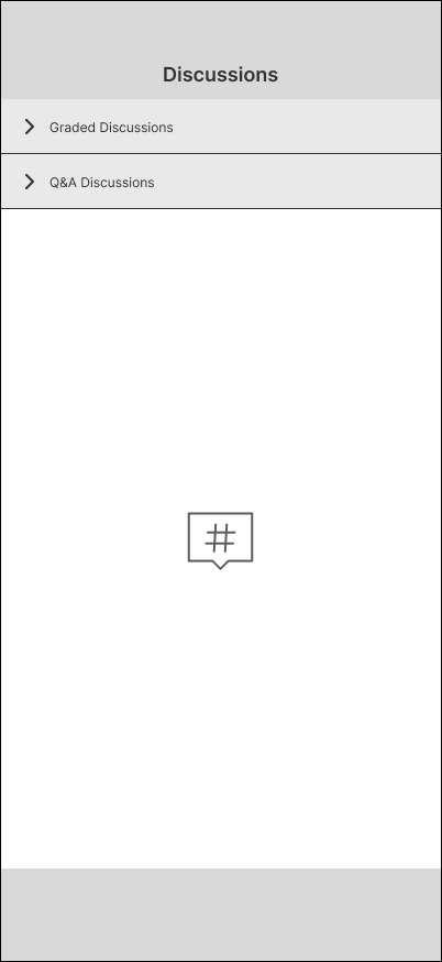
The original discussion page lacks clear categorization, making it hard for students to differentiate between graded and Q&A posts. The redesign introduces collapsible sections: Graded Discussions and Q&A Discussions, allowing students to quickly focus on the relevant category. This structure improves clarity and helps students navigate discussions more efficiently.

Search Function Redesign Sketch

Previously, the discussion board would display every post containing the searched keyword, often resulting in dozens or even hundreds of results. Now, we have divided the discussion board into smaller groups based on section times, along with a dedicated general Q&A discussion board. This way, when users use the search function, it will only return results from the specific discussion board they are in, making the process much more manageable.

Redesigns

The original Canvas discussion board had several usability issues. Users could only sort posts by time, making navigation rigid and limited. Keyword searches returned all posts containing the searched word across the entire board, leading to information overload. Additionally, the current reply functionality lacked the flexibility to support threaded discussions or quick reactions, further limiting engagement.

Design Goals

  1. Enhance Search Functionality: Enable users to find posts more easily by narrowing search results and refining the search process.
  2. Improve Sorting Options: Provide additional criteria for sorting posts to make navigation more flexible.
  3. Support Threaded Discussions: Redesign the reply functionality to support nested conversations for clearer communication.
  4. Encourage Engagement: Add interaction options, such as quick reactions, to make the discussion board more dynamic.

Redesign 1

Section-Based Groups

The discussion board is divided into groups based on class, section times, and further categorized with Q & A and homework discussion. This segmentation ensures that users can find specific discussion easily and gives discussion menu more structure and organization than before.

Improved Search Functionality

Searches are now restricted to individual discussion boards, making results more specific and manageable. This design ensures that users can focus on posts that are most relevant to their section or context. We also added more options for sort and discussion type to help users navigate better.

Threaded Reply Functionality

We reworked the reply button on individual comments, enabling users to reply directly to specific posts rather than only to the main thread. The Replies automatically include a quote of the message being responded to and the name of the user receiving the reply, providing clarity and continuity in conversations.

Quick Reaction Options

Users can now react to posts and replies with "like" icons, encouraging lightweight interactions without the need for a full reply. This feature adds a layer of engagement and feedback for posts, similar to the functionality seen in platforms like Slack or X.

Redesign 2

Tag-Based Categorization

Posts within each discussion board are now categorized with visible tags such as "Homework," "Q&A," or "Final." This design feature allows users to filter posts by their respective tags, creating a streamlined navigation experience. By organizing threads into meaningful categories, users can quickly locate discussions relevant to their needs without sifting through unrelated content, ultimately increasing productivity and satisfaction.

Keyword Search and Advanced Filters

The discussion search interface now includes a keyword search function, allowing users to locate specific posts efficiently. Additionally, expanded filtering options with dropdown menus enable users to refine the posts displayed on the discussion home page by types such as "Q&A," "Homework," and "General." Users can also sort the posts based on criteria like time, views, and likes. These enhancements significantly improve the usability of the discussion board by allowing users to easily search, organize, and navigate through the displayed posts, ensuring a more streamlined and tailored experience.

Course-Specific Discussions

The discussion landing page allows users to select discussion boards based on their enrolled courses. Users can view an "All Courses" option to see discussions across all their courses or narrow their focus by selecting a specific course from the dropdown menu. This functionality provides flexibility for users to customize their experience, enabling them to quickly access the discussions most relevant to their current needs while maintaining a clear and organized interface.

Threaded Replies and Quick Reactions

The threaded reply feature enhances discussion organization by allowing users to respond directly to specific comments within a thread, maintaining the context and flow of the conversation. Each reply is visually nested under the original comment, making it easier to follow the progression of the discussion. Additionally, the quick react function includes options like "like" and "bookmark," enabling users to not only show appreciation for posts but also save them for future reference. These features provide users with versatile tools to interact with discussions effectively, encouraging participation and fostering better information retention.

Second Round of User Testing Plan

Pre-Test Questions

  1. How often do you use Canvas discussion boards, and what do you usually do on them (e.g., searching, replying)?
  2. Which features in a discussion board are most important to you for improving usability (e.g., search, navigation, replying)?
  3. What is your biggest frustration when using discussion boards, and how do you usually try to overcome it?

Task-Based Testing (Prototype Comparison)

Participants will complete the same set of tasks for each prototype, with observers taking notes on task completion time, user comments, and navigation behaviors.

Task 1: Searching for Posts

  1. Search for a "Homework" post in both prototypes. Which prototype made it easier to locate the post, and why?
  2. Compare the filtering and sorting options in each prototype. Which provided more useful tools for narrowing down your search results?

Task 2: Navigating Between Courses

  1. Switch between discussions in two different courses. Which prototype feels more intuitive for navigating between courses, and what specific design elements helped or hindered you?
  2. Did either prototype make it easier to identify ongoing discussions in different courses? How?

Task 3: Engaging in a Thread

  1. Reply to a specific comment in a discussion thread in both prototypes. Which one made it easier to maintain the conversation context?
  2. Compare the experience of reading through a threaded discussion in both prototypes. Which one felt more organized or easier to follow?

Post-Test Questions

  1. Overall, which prototype did you prefer, and why?
  2. Which features from each prototype stood out to you as particularly effective or beneficial?
  3. Were there any features in either prototype that felt confusing or unnecessary? Which ones?
  4. Did either prototype feel more consistent with your expectations of how a discussion board should work? Why?
  5. If you could combine features from both prototypes, which would you select, and how would you integrate them?

Observer Notes and Metrics

  • Time-on-Task: Measure how long it takes to complete each task in both prototypes.
  • Error Rate: Record any user errors or instances of confusion during tasks.
  • Verbal Feedback: Note user comments about likes, dislikes, and suggestions.
  • Engagement Metrics: Track user interactions with features like filtering, replying, and liking.

Second Round of User Testing Analysis

Task 1: Searching for Posts

Redesign 1

While precise, users found the additional clicks burdensome, especially for broader searches.

Redesign 2

Users appreciated the ability to narrow down results quickly and intuitively with tag functionality.

Task 2: Navigating Between Courses

Redesign 1

The navigation required multiple clicks and lacked a clear overview of discussions across courses. Users described the experience as functional but inefficient.

Redesign 2

The dropdown menu and "All Courses" option provided flexibility and quick access to discussions across multiple courses. Users praised the streamlined process and the ability to compare ongoing discussions across courses.

Task 3: Engaging in a Thread

Redesign 1

The reply quoting feature provided clarity and preserved conversation context. Users valued the clarity of the quoted replies but struggled with thread navigation.

Redesign 2

Thread nesting made it easier to follow and maintain the flow of conversations. Users found the nesting intuitive and visually appealing for tracking replies.

Strengths and Weaknesses of Each Design

Redesign 1

Strengths

  • Section-based grouping for structured organization.
  • Precise board-specific search.
  • Reply quoting for conversation clarity.

Weaknesses

  • Restrictive search functionality.
  • Inefficient navigation between courses.
  • Dense, segmented visual design.

Redesign 2

Strengths

  • Flexible tag-based categorization and advanced filters.
  • Intuitive navigation across courses with a global overview.
  • Nesting for clear thread organization.
  • Modern, visually appealing design with enhanced readability.

Weaknesses

  • None noted, but the additional features could slightly increase the learning curve for first-time users.

Lessons Learned

  1. Streamlined Navigation is Crucial: Redesign 2’s dropdown menu and global course view proved essential for users managing discussions across multiple courses.
  2. Customization Enhances Usability: Features like advanced filters and bookmarking cater to diverse user needs, improving satisfaction and efficiency.
  3. Visual Design Matters: Users favored Redesign 2 for its modern design and readability, which reduced cognitive load.
  4. Balance Structure and Flexibility: While Redesign 1’s rigid structure worked for some scenarios, users generally preferred the flexibility of Redesign 2.

Final Recommendations

Based on user testing results and analysis, Redesign 2 should be adopted as the primary approach for improving Canvas discussion boards. It offers significant advantages in usability, flexibility, and visual design, aligning with user expectations for a modern, efficient platform. However, incorporating the reply quoting functionality from Redesign 1 will further enhance conversational clarity, particularly in complex threads.

Why Redesign 2

Superior Navigation

  • User Need: Efficient navigation across multiple courses and discussions.
  • Redesign 2 Strength: The dropdown menu and "All Courses" view provided intuitive, flexible options, enabling users to seamlessly switch contexts and track ongoing discussions.

Enhanced Search and Filtering

  • User Need: Quick and precise access to relevant posts.
  • Redesign 2 Strength: Advanced filters, keyword search, and tag-based categorization enabled users to locate content faster and more effectively than in Redesign 1.

Improved Engagement Features

  • User Need: Lightweight and meaningful interaction options.
  • Redesign 2 Strength: Bookmarking and reaction features added depth to user interactions, fostering participation and long-term usability.

Modern Visual Design

  • User Need: Readability and ease of use.
  • Redesign 2 Strength: The use of spacing, colors, and typography enhanced readability and supported quick scanning of discussion content, reducing user fatigue.

Opportunities for Incorporating Redesign 1 Features

Reply Quoting Functionality

  • Reason: Maintains conversational clarity by including quotes and user references in replies.
  • Integration: Add quoted replies as an optional feature within Redesign 2’s threaded structure to combine clarity with intuitive organization.

Structured Section Grouping

  • Reason: While tag-based categorization works well for most users, structured grouping could be useful for larger courses with distinct sections.
  • Integration: Offer an optional toggle for section-based organization for users who prefer a more rigid structure.

Team Contributions

Cindy Jin: Led the creation of user testing plans for both the first and second rounds, analyzed results from the first round of user testing, selected the discussion board component for redesign, developed sketch solutions, contributed to building the second redesign prototype, and executed user testing sessions across both rounds.

Daniel Xie: Contributed to the introduction and competitive analysis research, developed sketch solutions, created the first redesign prototype, designed the second-round user testing plan, analyzed results from both rounds of user testing, executed user testing sessions across both rounds, and synthesized findings into final lessons learned and recommendations.

Kexin Zhou: Participated in the introduction, executed user testing sessions across both rounds, analyzed results from the first round of user testing, conducted competitive analysis research, developed sketch solutions, and contributed to building the first redesign prototype.

Zhaorui Zhang: Created the first-round user testing plan, executed user testing sessions across both rounds, analyzed results from the first round of user testing, developed sketch solutions, and contributed to building the second redesign prototype.